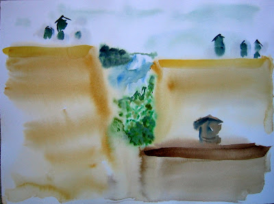
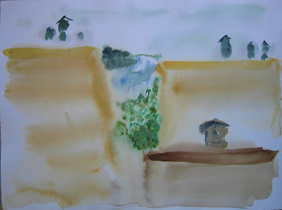
 This painting, the seventh in the series, is my favorite. From this painting I learned that if you can crop many images out of one painting, it probably has a lot going for it. Watch the coming posts to see what I mean.
 The brighter one was edited on IrfanView. The color in the original painting looks like something halfway between these two. I love the way the big shapes seem to distort the proportions of the paper.
No comments:
Post a Comment