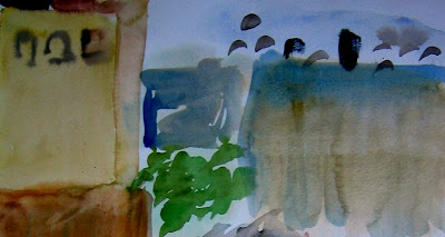
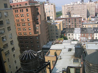
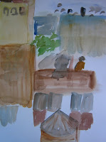
 This is the third image I painted. I was mulling over how to approach the complex scene before me -- see yesterday's post for another photo. On this attempt, I was sketchi
 ng with my brush, playing with the options -- what to include, what to eliminate. Should I go for basic shapes? Include architectural details? Colors?
Once again, cropping and doing a bit of editing on IrfanView improved the composition. And, once again, this holds little resemblance to New York City! LOL!

Visit my Flickr Painting set for more images.

No comments:
Post a Comment